Redesign of ATPCO's customer portal in Drupal
ATPCO
UX Design
Oct 19- Jun 20
ATPCO (Airline Tariff Publishing Company) is the trusted leader in airline pricing and retailing content working with 440+ airlines and 200+ channels.
The focus of this project was to redesign ATPCO's customer center in Drupal while keeping in mind the needs of a large and very involved global airline customer base. The new portal had to fulfill the multidisciplinary needs for ATPCO's customers and large staff.
My team was tasked with the redesign of ATPCO's customer authenticated portal to improve workflows for both customers and employees.

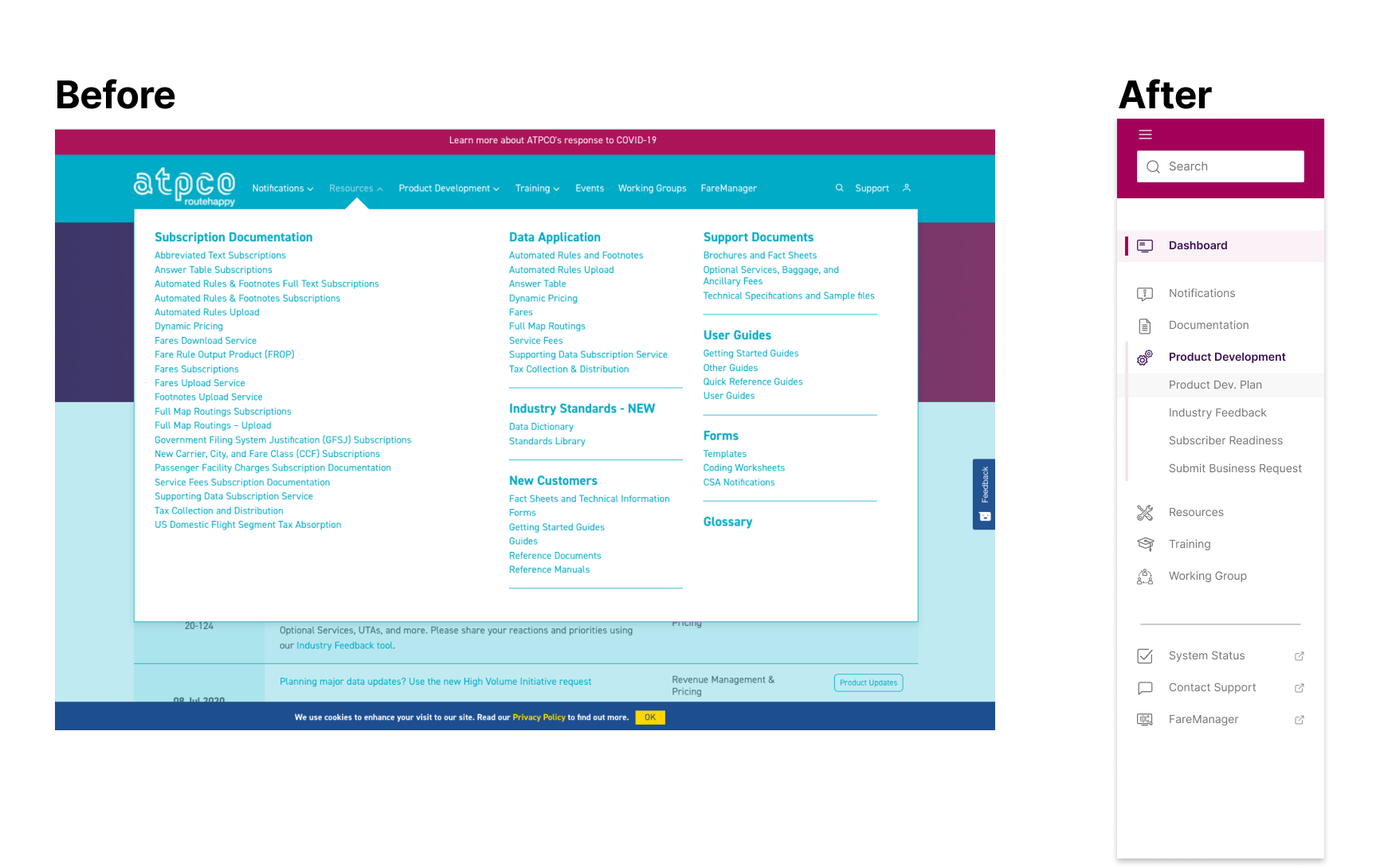
Screenshot of the previous customer portal

Planning & Stakeholder interviews
Secondary research
User surveys and interviews

Gather requirements
Define key problems and opportunities

Information architecture
Wireframing

Visual design
Prototyping
User testing
Design Iterations
Developer handoff
I worked with New Target (Digital Agency) and ATPCO's stakeholders from October 2019 to July 2020 from Discovery to Delivery. The initial planning and discovery phases were conducted by New Target, and based on their user findings, I designed and tested solutions for the main problems brought up by customers and ATPCO's employees.
5 online/phone interviews with ATPCO customers, as well as 3 interviews with internal staff, were conducted. From those interviews, ATPCO got high-level feedback on how the Customer center was being used and which were the biggest pain points for users. As a result, several opportunities for improvement were found.
Both customers and ATPCO employees had common needs and frustrations:
One of the largest hurdles to overcome in the redesign was the sheer amount of data that end-users needed to find and visualize while visiting the customer portal. Therefore, I started ideating solutions based on key insights found through user interviews and card sorting. These solutions were focused on presenting large datasets in a way that customers could easily understand and find what they needed, including:

Users felt the welcome banner on the homepage was taking too much space and not letting them quickly find valuable content. In addition, they reported having issues finding the specific type of content they needed because navigation wasn't intuitive and the search feature didn't yield accurate results.
Creating a Dashboard with an "Activity Feed" so that users can:

One of the primary challenges identified by both customers and employees was the overcrowded and complex navigation. Recognizing the impact on user experience and operational efficiency, we initiated workshops aimed at exploring innovative solutions to enhance the information architecture. Collaborating closely with customers, we conducted card sorting exercises to validate and refine the proposed improvements, resulting in a new and simplified site navigation.
I began wireframing the pages and introduced new UI elements to enhance searchability and findability. These additions were strategically designed to improve user navigation and overall accessibility, addressing the key concerns raised during our workshops and card sorting sessions.


To align with Atpco's rebranding efforts, I created a comprehensive style guide for web assets. This guide ensures consistency in design elements, colors, typography, and overall visual identity across their digital platforms, reinforcing their brand image and messaging for a cohesive user experience.

After going live with ATPCO's new Customer Center site, we conducted user interviews, sent out surveys, and analyzed Google Analytics data. The new site improved the customer experience for over 440 airlines and 200 sales channels. Key findings after conducting this user research:
Below you can see the designs in a Desktop breakpoint for:


